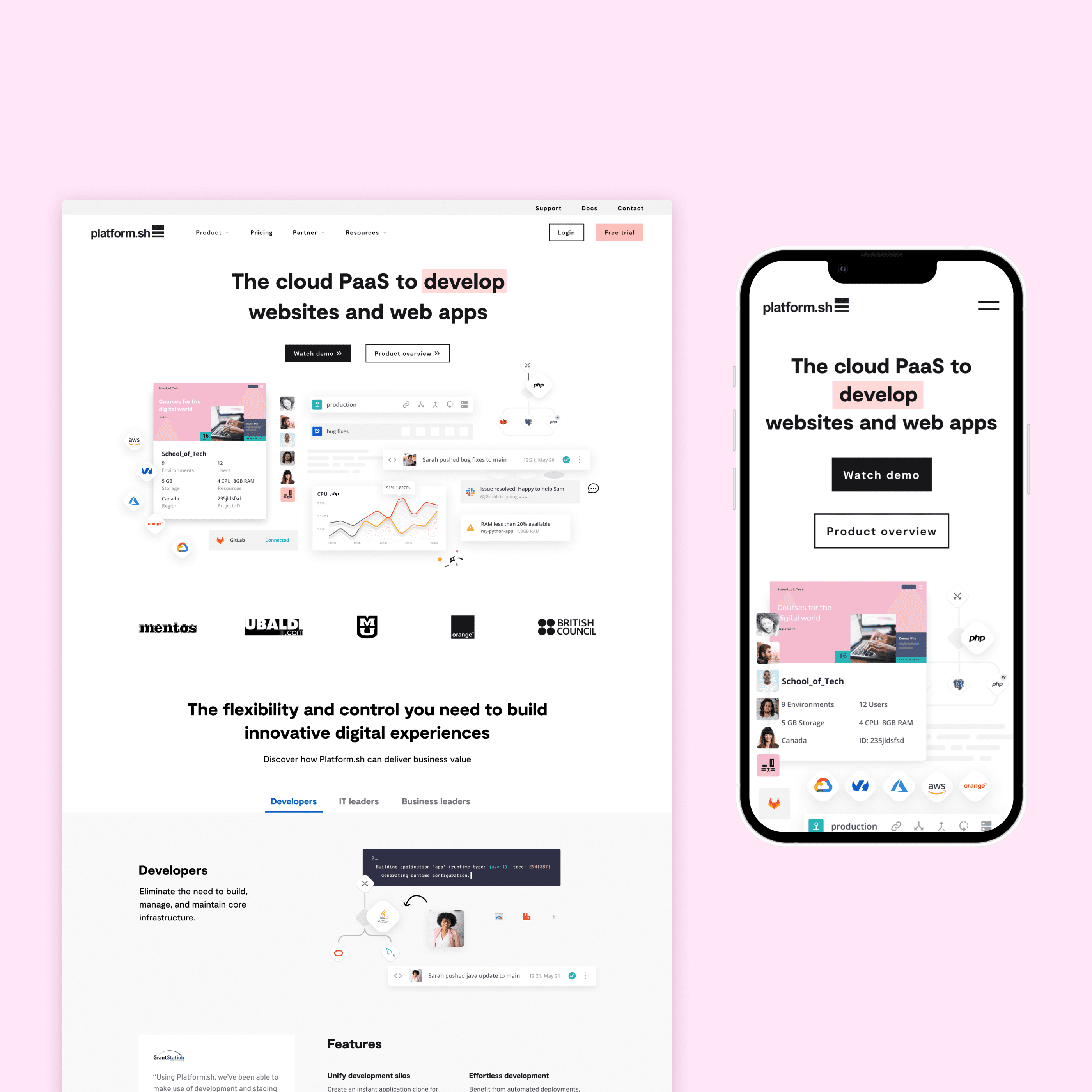
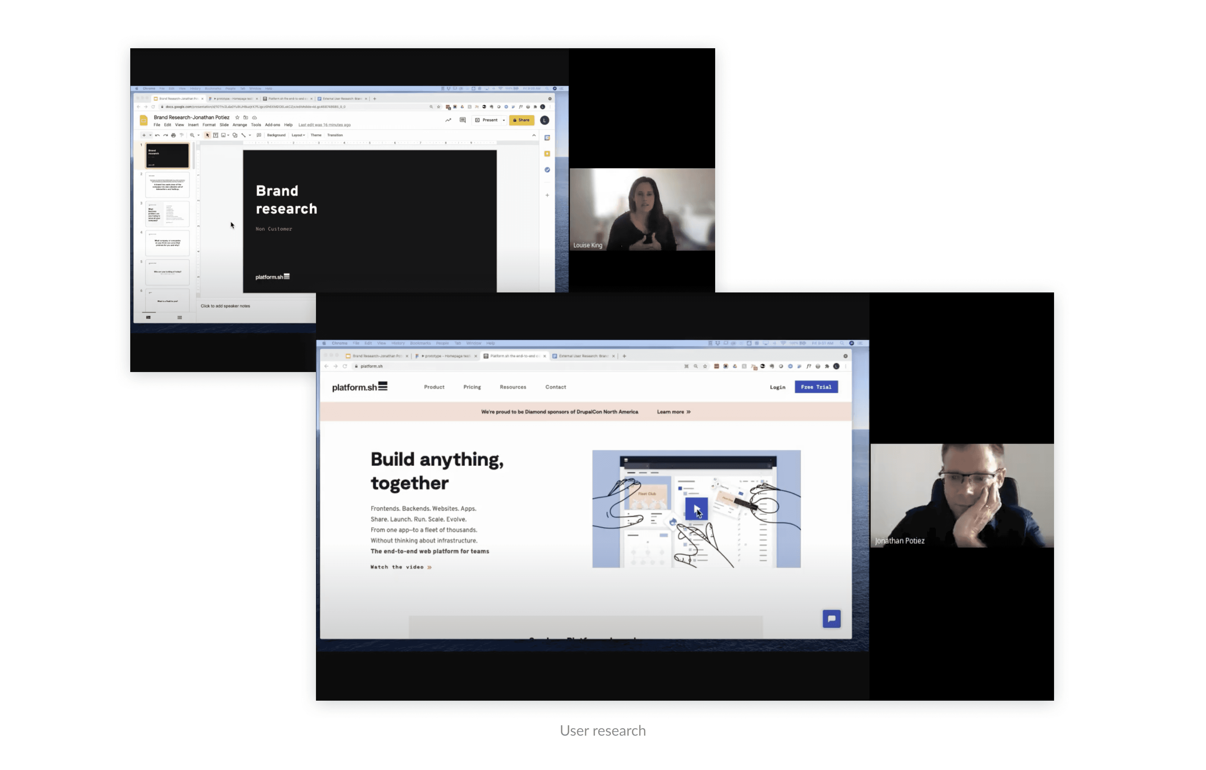
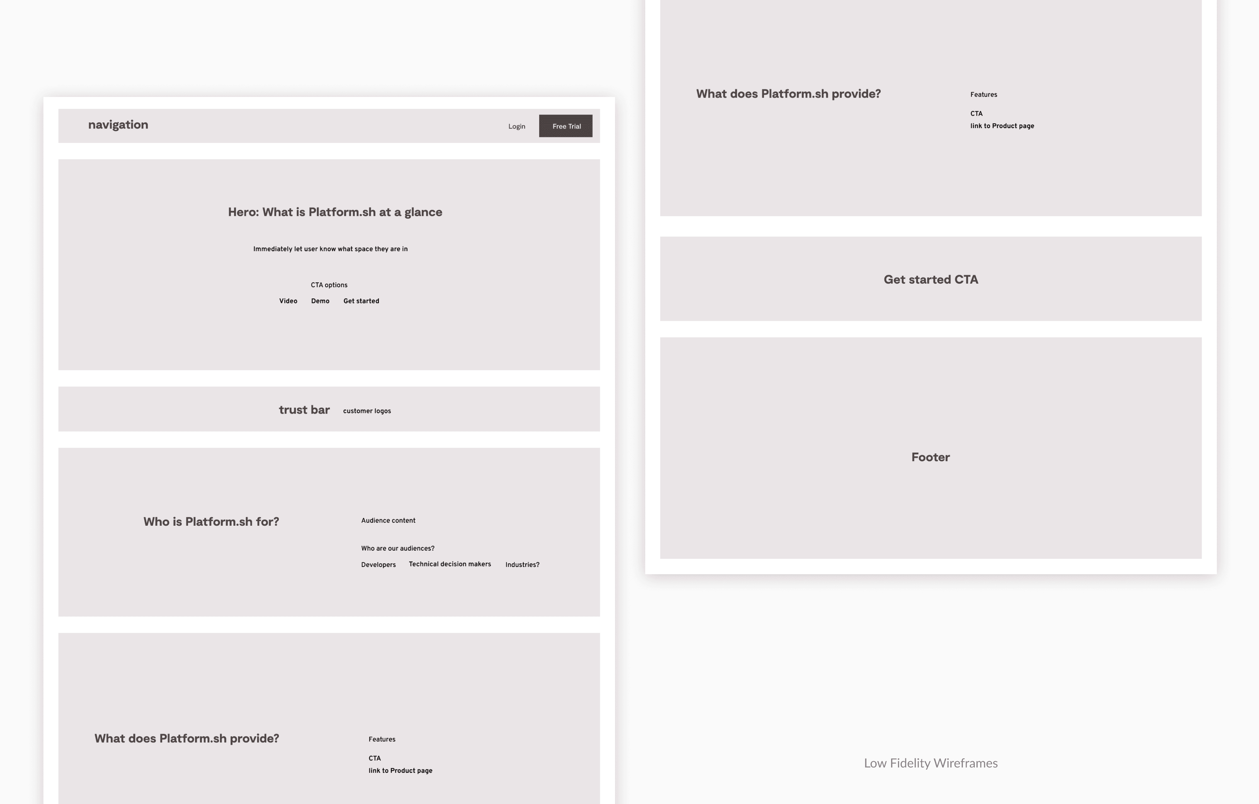
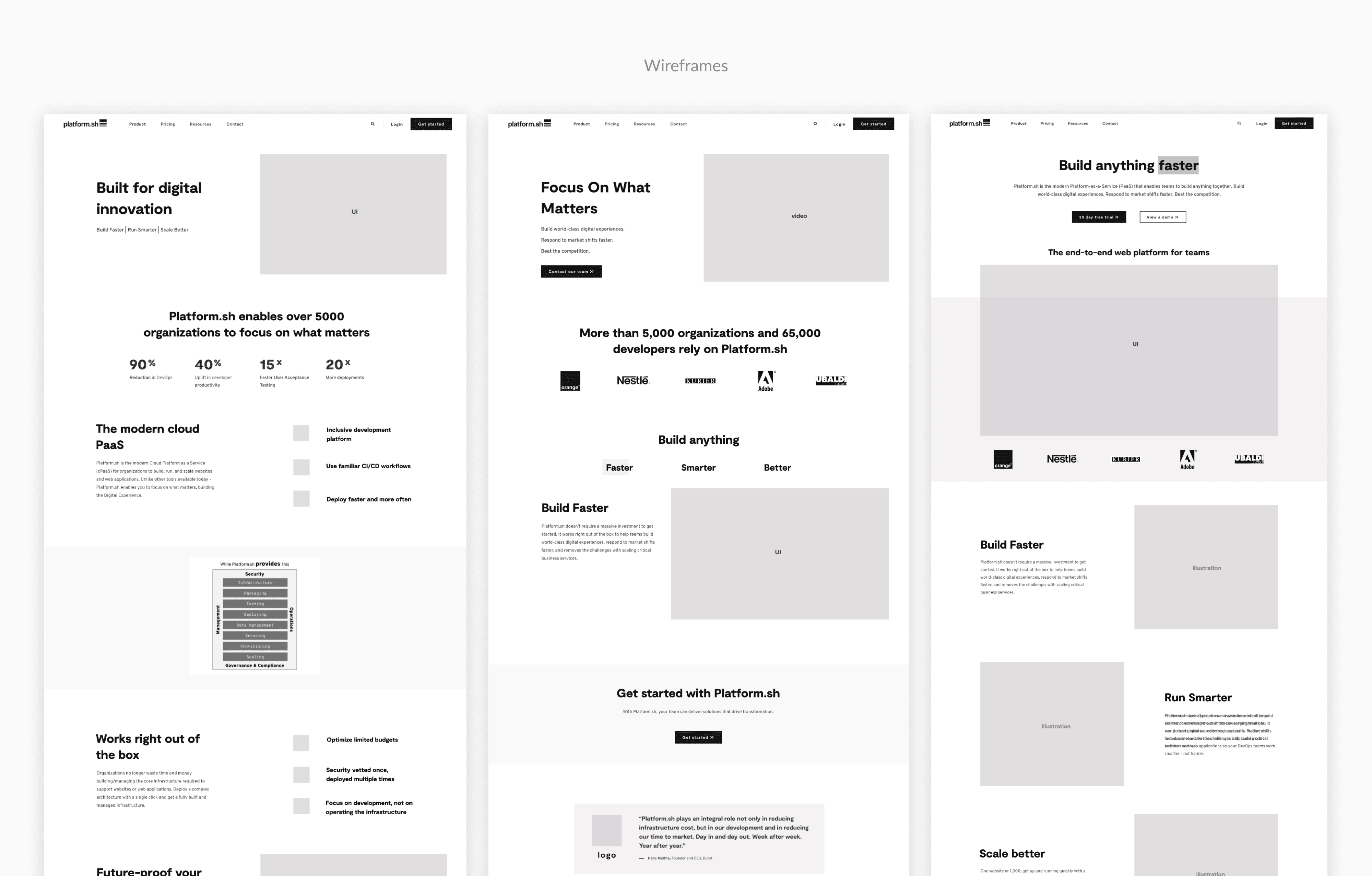
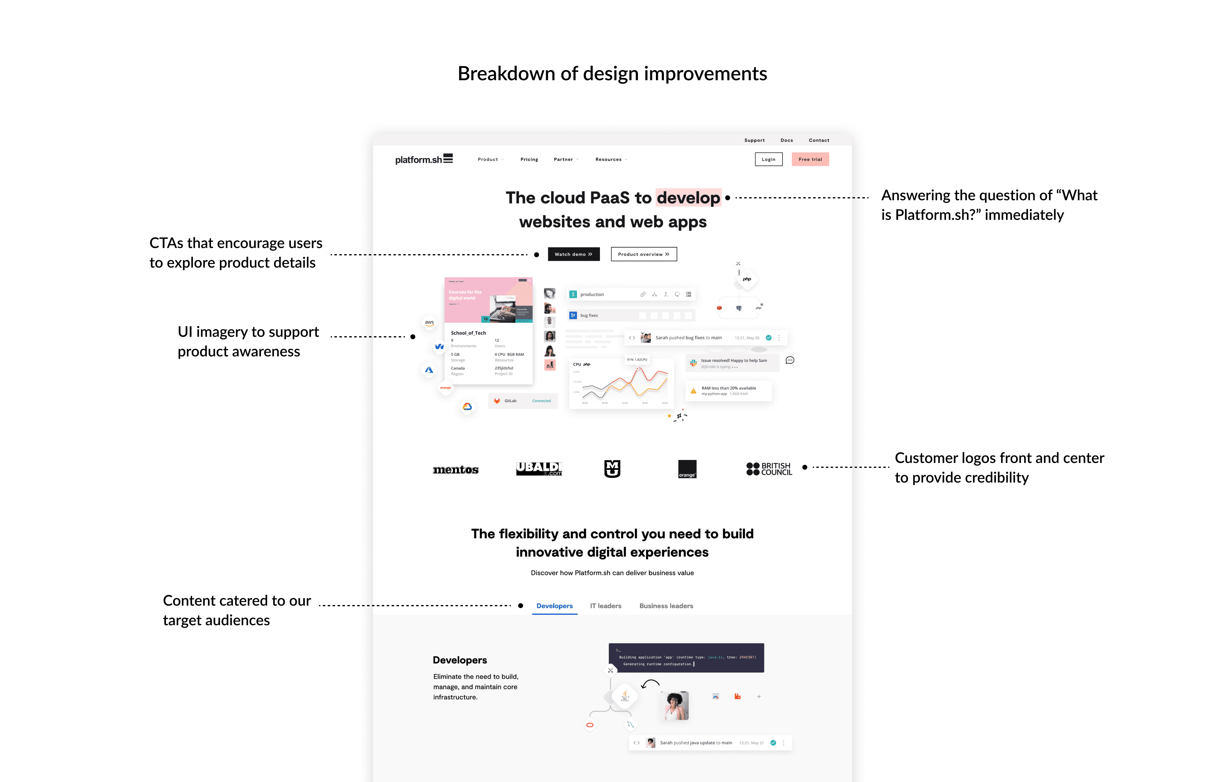
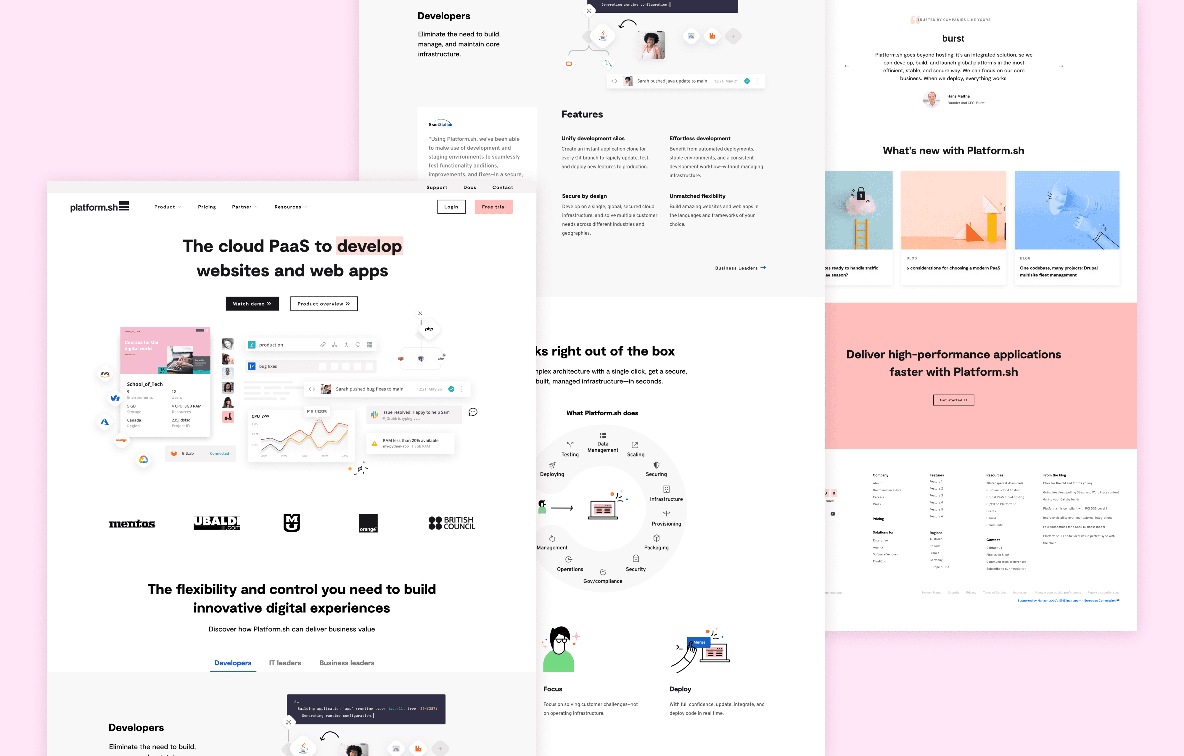
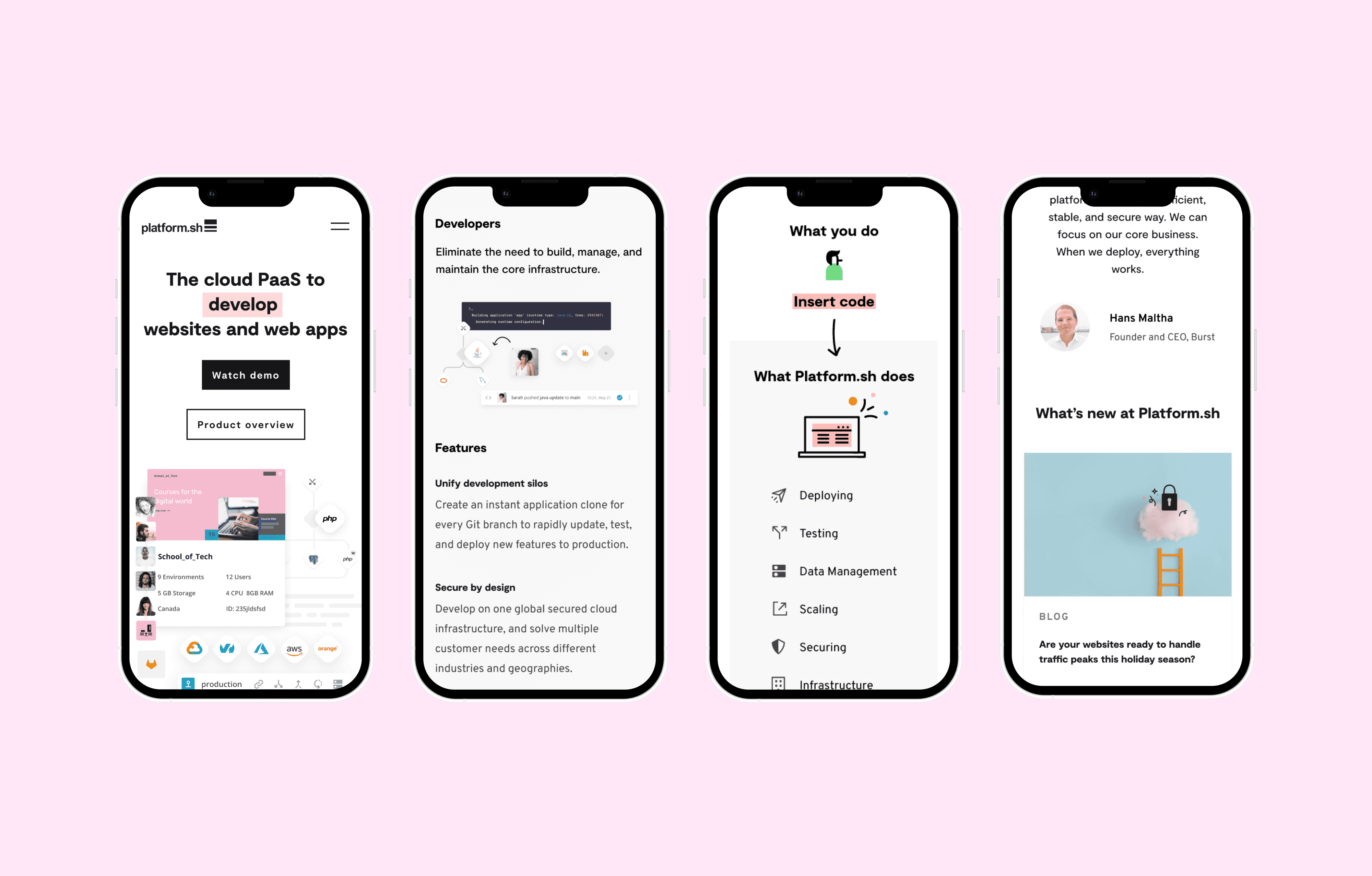
In 2021, the brand team did user research to find out how potential customers were perceiving our brand, messaging, and website. We used the research data to define our main users and take an audience based approach to redesign the homepage. I was the sole designer on this project. I facilitated user research, ideated early concepts, ran design sprints, presented regulary to leadership, and produced final files for development. I worked with multiple cross-functional teams including 1 front end engineer and leads from Brand Design and Marketing.
Company:
Platform.sh
Year:
2021
The Challenge
Based website analytics, we knew we had a high bounce rate and low engagement on the homepage. We also needed to address the reoccurring feedback that users don't understand what our product is from the homepage.
Goals
Business goals:
Capture audience attention and decrease the bounce rate
Increase engagement, free trial starts, and lead generation from homepage
Design goals:
Cater the homepage content to the audiences that were discovered in the brand research
Provide more product context with better imagery and messaging
Process
User interviews
We interviewed 10 potential users with questions about our brand, messaging, and website. As part of the interview, we showed two versions of our homepage - the current one and a prototype of a new design - to get feedback on improvements and validate any assumptions.
Research findings
From the research, we found that users perceived our current website as too ambiguous. Some found that it was bland and lacked emotional connection. They perceived a lot of content as jargon without any substance. They still didn’t fully understand the Platform.sh product or how it would solve their problems. Users wanted to quickly see our product differentiators, and have content that specifically addresses their situation and pain points. Some also felt that the imagery did not illustrate or support the product.
Overall, the new homepage prototype scored higher than the current version. However, users felt that too much content was removed from the prototyped version. The UI focused imagery in the prototype scored well. The messaging was generally better understood, but users wanted more specific information.
Defining our audience
From the user research, we uncovered a primary audience and a secondary audience:
1. The primary highly technical user. They may be a developer, IT admin, or manager of one of those departments. They probably don’t have the full purchasing authority for a product at our price point and they will likely have to convince someone else about the benefits of Platform.sh.
2. The secondary less technical user. These people need to understand relevant information quickly to determine whether Platform.sh is appropriate for their organization. They are part of the approval process on teams in procurement, infosec, and compliance or from a less technical background in business, marketing, or finance.
We needed to address both of these audiences in the redesign. For the more technical primary audience, we needed to provide a compelling story to the competitive advantages of our product and link to more in-depth technical information, tools, and people to help finalize their decision. For the less technical secondary audience, we needed to provide a convincing but concise supporting story that will help them understand the product at a high level. This audience may not go as deep into the website, so they need to “get it” quickly.
Results
In 4 days post launch of the new homepage, we had:
47% more people visit the Product Overview page. This means people were digging deeper into our site and spending more time.
415% (no, that’s not a typo!) more people visit the Demo Video page. This led to more lead generation and free trial starts.
20% less people visit the pricing page from the homepage (but the actual number of people visiting the pricing page stayed the same). This shows they they are exploring the product before viewing the pricing rather than evaluating first by pricing.
Overall, this data shows redesign is encouraging visitors to learn more about the product and get a better understanding of the value Platform.sh offers.
An unexpected benefit:
Improvement in number and quality of Platform.sh job applicants.
“Throughout my interviews, the product designers are all commenting how unique, cool and high quality they think our company and product is based of what they see from our website”
- Natalie Harper, Director of Product Design
