Platform.sh needed an improved process and tools to design, develop, update, scale, and deliver quickly on their marketing site. So I created a design system from scratch. I was lead designer and manager of this project. In the role of Digital Design Manager, I managed a web designer and worked directly with two front-end engineers. I created and facilitated new design processes, ideated concepts, and ran design sprints. I worked with multiple cross-functional teams that included leads from Engineering, Brand Design, and Marketing.
Company:
Platform.sh
Year:
2022
The Challenge
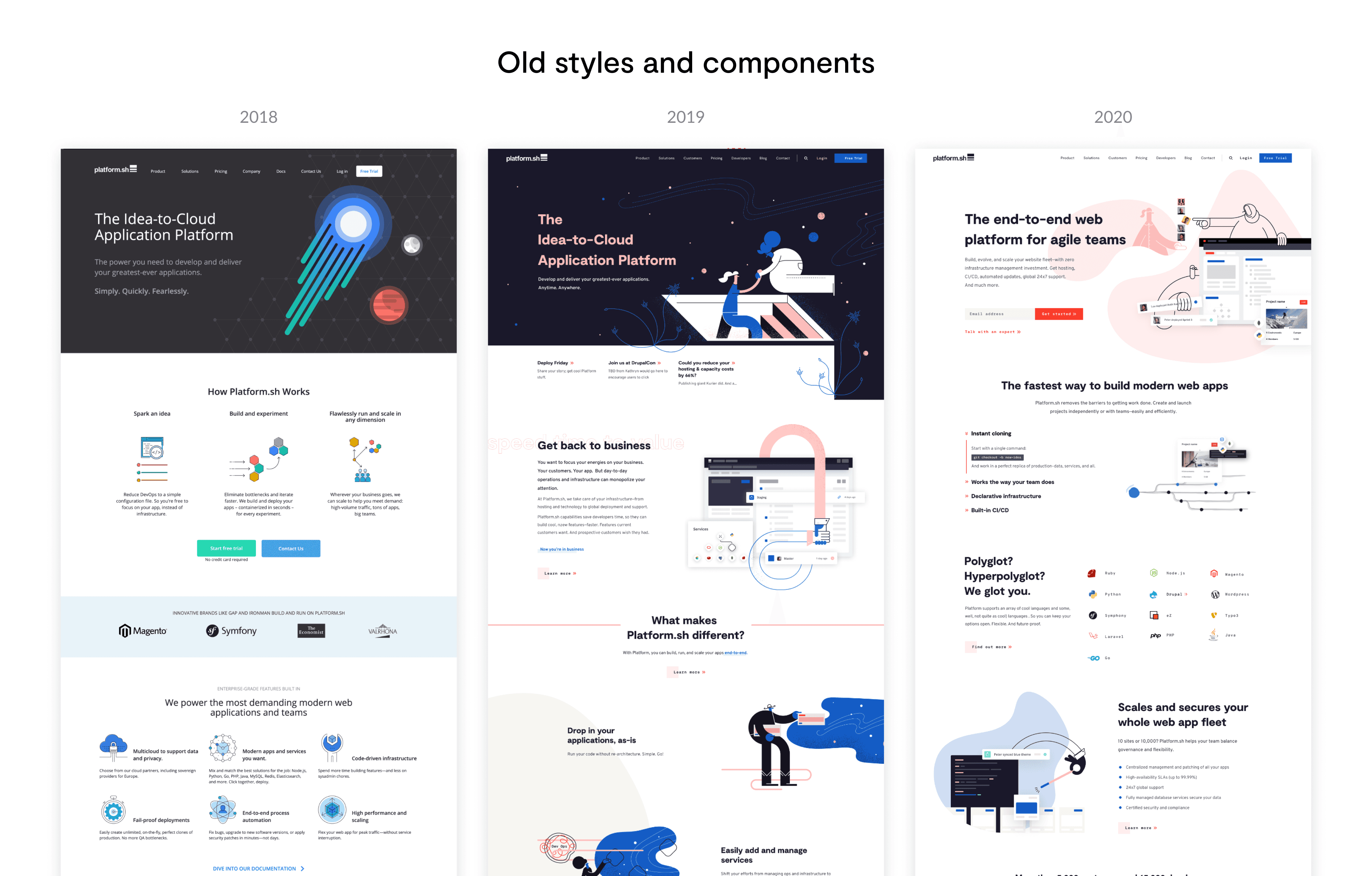
In 2018, Platform.sh was a start-up that was quickly scaling. During that time, the company rebranded and built a new website. Unfortunately, the website didn’t have a strict UI style guide. By 2021, we needed to move the website build from a static site generator to a more flexible headless CMS. Three years of not following any set guidelines had led to inconsistent design patterns, poor user experience, and a really messy code base that was impossible to move. The lack of process and guidelines also created slow design and development time on new content. All of these issues caused tension between marketing and design teams during projects. We needed a better foundation.
Goals
Business goals:
Get to market faster (faster design and development time)
Improve cross-team collaboration
Design goals:
Improve design and development consistency on the site
Create a source of truth and foundation for design decisions
Improve accessibility and user experience on the marketing site
Process
First steps
Creating a simplified, cohesive design system from the huge mess seemed like a monumental task. So I began the same way I start any overwhelming project: by making a list. What started as a Google Doc list of styles and components pivoted into a design audit in Figma where I could visually see everything. I took screenshots of the live site and pulled in our design files to compare and document patterns and inconsistencies. Not only were there inconsistencies in the design files, but also inconsistencies between the design files and the live site. Because we didn’t have repeatable components and methods for building pages, designers and developers were creating every page reactively from scratch.
Assess, simplify, repeat…
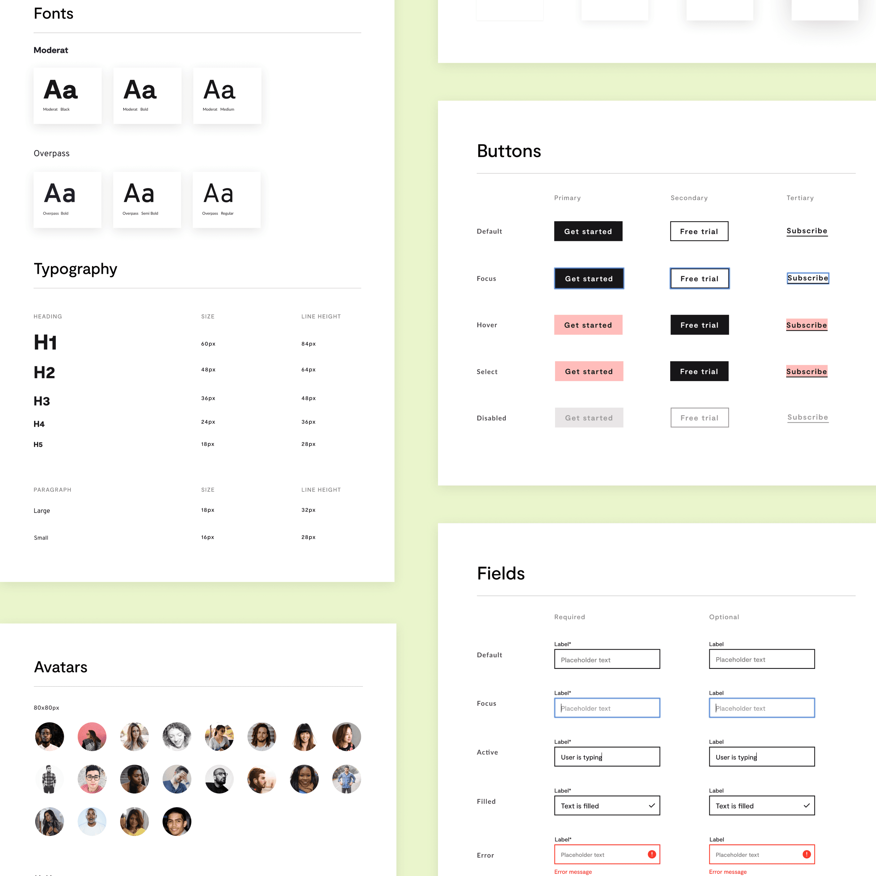
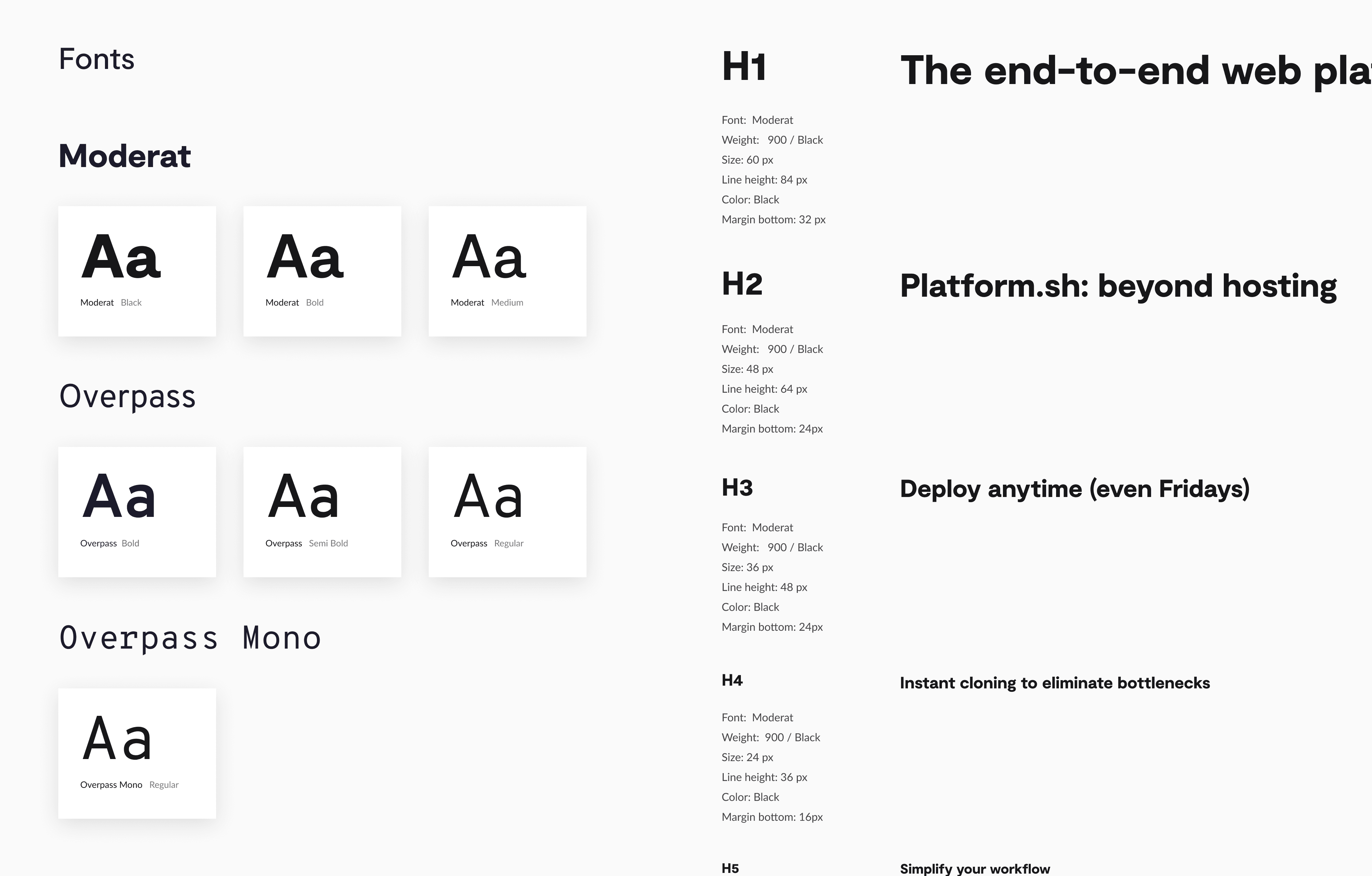
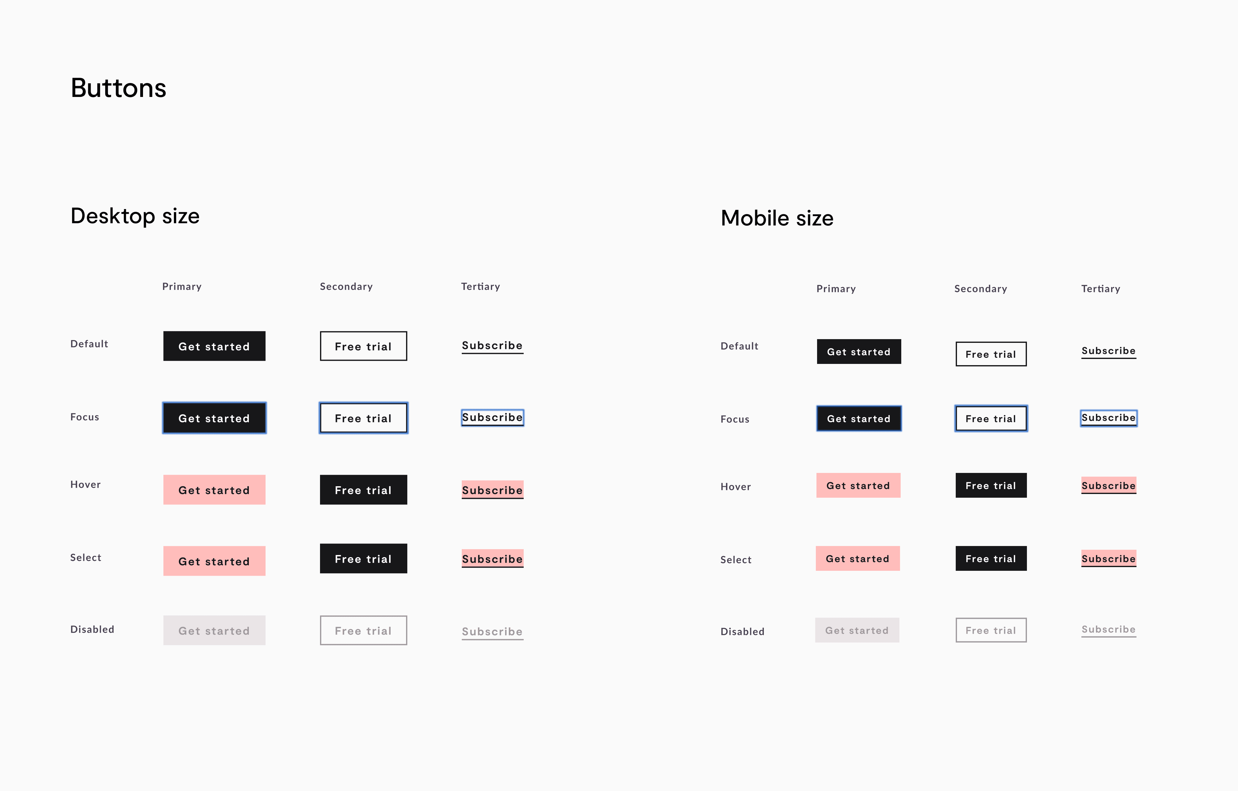
I dissected all of our previous pages into their components and styles. From there, I could take stock of what we had - the dozens of heading sizes, numerous hex codes of the “same” brand color, buttons in all different sizes and colors, ect. I assessed all versions similar, but slightly different, components and simplified it into one. We had over a dozen heading styles that I merged into a standard H1-H6. In some cases, like buttons, none of the current styles would work. The color contrast was not compliant, the animations were distracting instead of enhancing, and the different button types didn’t work together as a cohesive set. I created a new set of three button types - primary, secondary, tertiary - with a more polished look and hover animation.
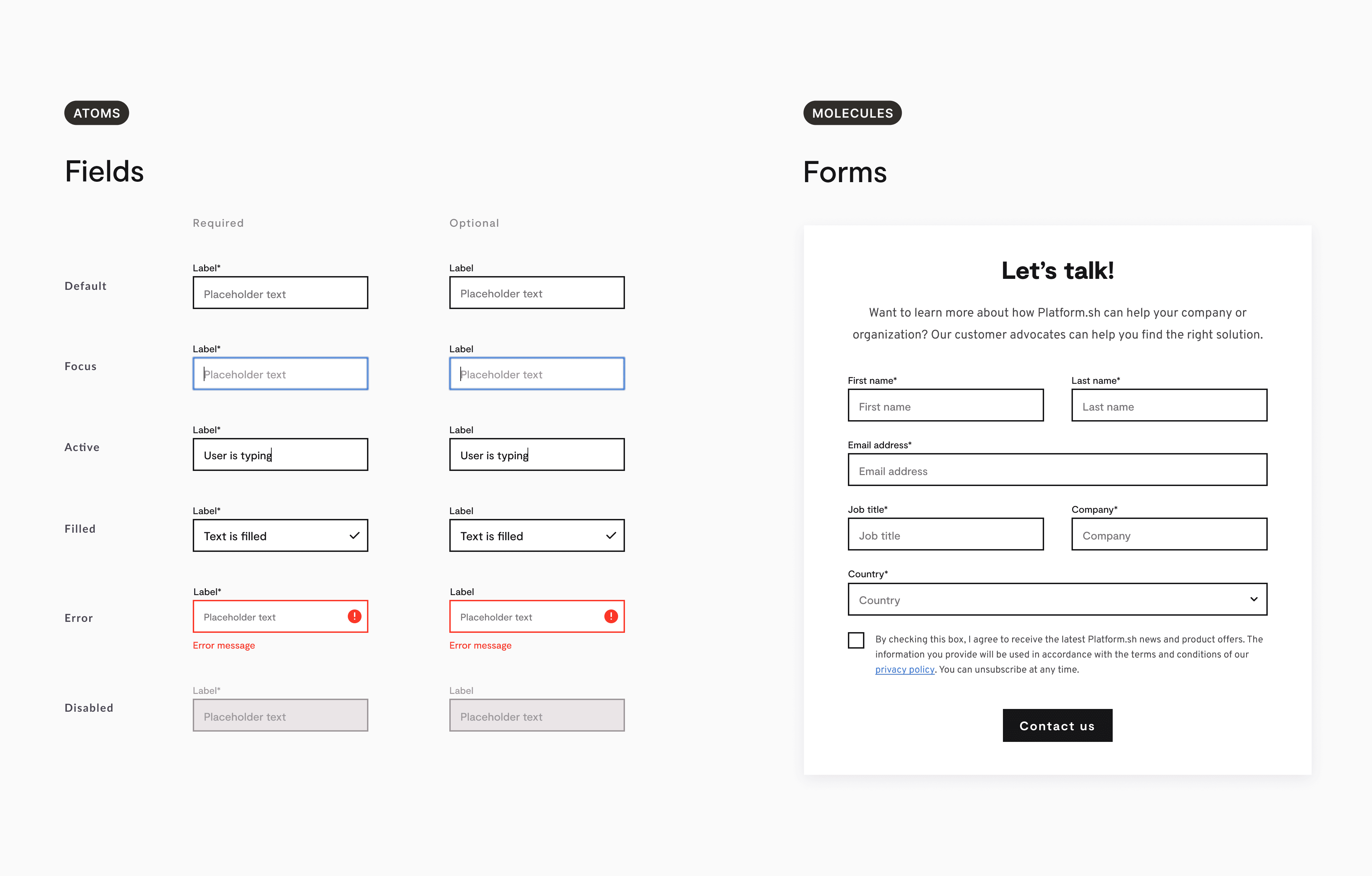
In some cases, I needed to redesign a previous component style to be more accessible. An example of this was the redesign of the input fields. Based on user feedback, the default version with a grey background looked disabled. I redesigned them with better color contrast, clearer differences between the states, and added a label above the field to improve accessibility.
During the audit, I found areas without implementation guidelines that created inconsistencies and developer hand-off issues. For example, I created guidelines for our image sizes and export process. I set up documentation for grids and spacing guidelines on an 8-point system.
Setting up the foundation
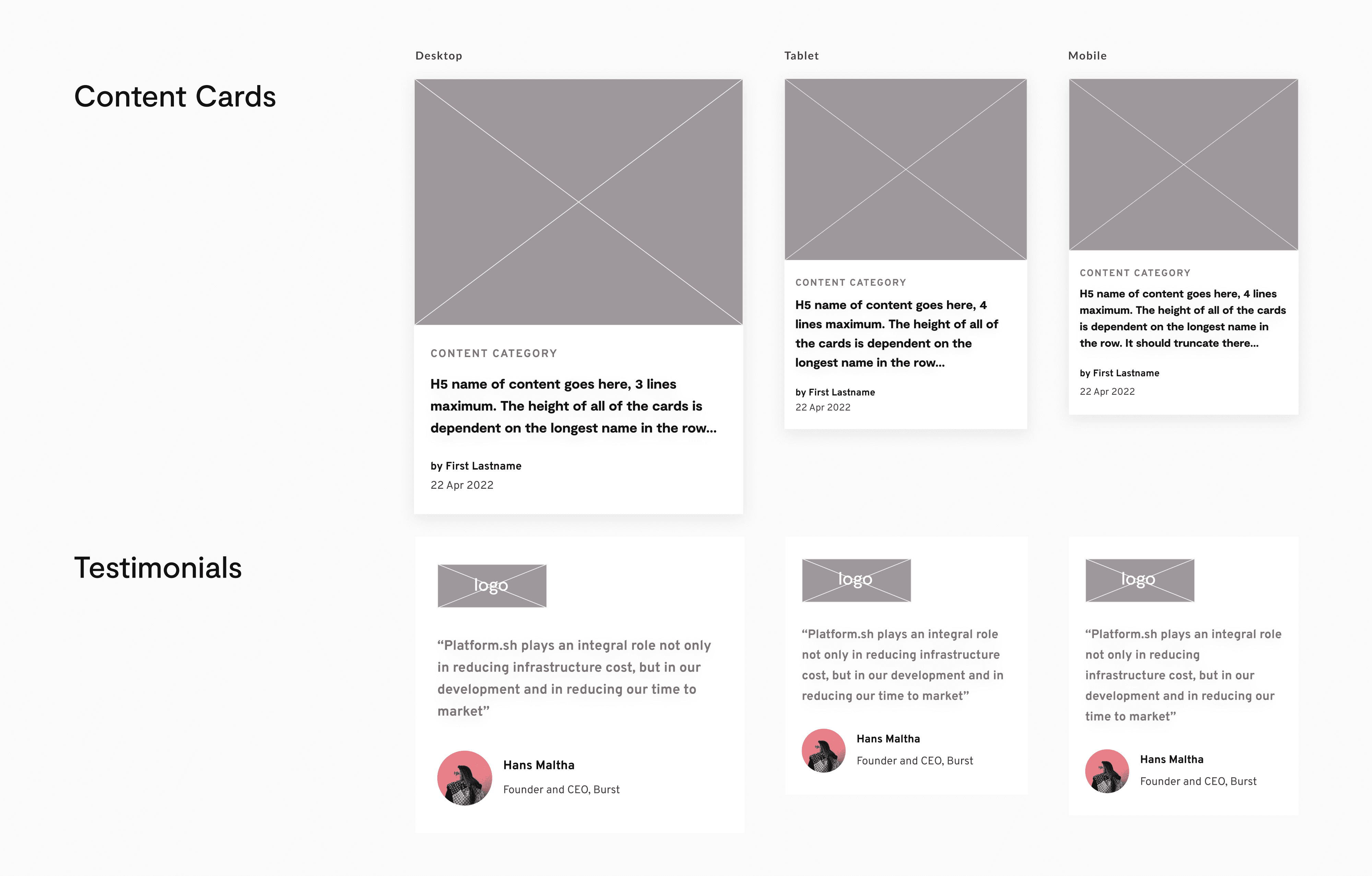
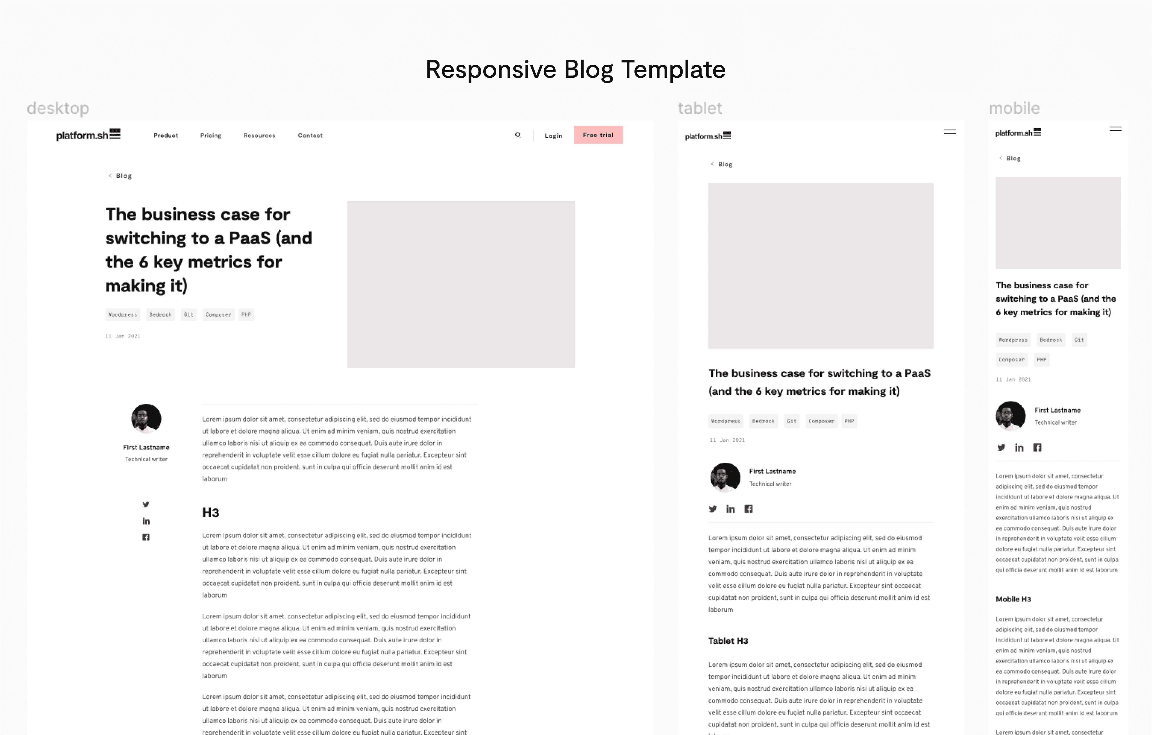
I set up the design system components based on the Atomic Design Methodology. Components in Figma are grouped in categories called atoms, molecules, and organisms. These became the foundation of how we design and develop the site. From there, I created templates for pages that were used repeatedly like blog posts.
Results
400+ components
Reusable, repeatable, responsive, and consistent components and guidelines documented in Figma for designers and Storybook for developers
Quicker Design to Dev builds
A single campaign page used to take us over a week to be designed and implemented and now takes only a day or two.
Improved collaboration
The design system provides common language and single source of truth for alignment on projects which improved processes between marketing and design.
